
I've joined The Cut Shoppe DT!!!
It's no April Fools joke. If you've been on Instagram you will have seen the announcement. I'm honored to have been invited by Ashley Horton to join The Cut Shoppe's Design Team for the April - September 2018 term!!!


Studio Room Tour and what's coming up for 2019!
Hello friends & Hello 2019! I've got a couple special videos up on my YT channel. The first one is a quick chat letting you know what my goals are for this year in the crafty world. The second is a way-overdue tour of my crafty space. So grab a cuppa, sit back, and enjoy!💚
New Design Team: Color Cast Designs
I'm over the moon to announce that I've got a new adventure ahead for 2019 joining the Color Cast Designs Creative Team!!! So be on the lookout for tons of yummy acrylics and wood veneer in my upcoming projects! :D


My Scrap Gals Episodes

Hey y'all, I've done it again! I was invited to be on the Scrap Gals Podcast, for the third time this year! So I thought I'd gather up all the links in one place. Happy listening and Go and Be Crafty....


First Day of School with Simple Stories School Rocks + FREE Chevron Cut file.
FIRST DAY OF SCHOOL
Hello friends. Iris here with a back-to-school layout that goes back to some basics: the SN@P! Basics Maple/Cream Notebook paper, an easy cut file, a few embellishment clusters, a little stitching, some ink splatters, and the fabulous School Rocks! collection.Using a modified cut file, I cut four rows of chevrons from the Notebook paper. Notebook paper always makes a great neutral to pair with colorful papers, and it's especially awesome with a school collection.

To capture the mixed feelings my daughter had on her first day of 2nd Grade, which is what the journaling is about, I printed a 4x6 photo of my daughter smiling as she waited outside, and also a 3x4 photo showing her sitting at her desk with an uncertain look. I placed them a little off-center opposite the journaling, and united them with a cluster of circles. The "FIRST DAY OF SCHOOL" circle - how awesome is the letterboard look! - is meant to be the title, so I popped it up on foam to make it stand out. I also added a staple to the cork circle for interest.
The chevrons give motion to the page and I accented that motion by stitching down the center of each row where the points are. I wasn't concerned about making the stitching perfectly straight. It adds to the fun if it's a little crooked. ;)


In each row, I placed word strips in random places. So that they don't look like they are floating, each is anchored by another sticker element. Since the bottom star has a staple, I added staples to the other stars, which also help anchor those strips. The apple and paper airplane are up on foam so that they continue to grab the eye up the page.

I added my date at the top right of the page, just like they teach us in school. The pencil journaling stickers in the collection fit the roller date stamp perfectly. For the finishing touch, I picked a yellow mist (SC Mister Huey's in Custard) because it helps fill in the blanks around the three main areas but doesn't compete with the rest of the background.

Back-to-school time for kids means more scrap time for moms, am I right?! What better way to start than with some back-to-school scrapping with the School Rocks! collection. :)
Click here to grab the Chevron Cut file to play with!
Father's Day layout and free cut file...
Hello, hello! Yeah, I know, this place has been echos and cobwebs for months now. 😬
But today I'm posting a layout I made for The Wild Hare Kits, along with a little free download! The boss is away on vacay, my scheduled post did not go up before she left, and I wanted to share this before June ended. (Still 5 hours left 😜) . At the end I'll have that free cut file.
**********


But today I'm posting a layout I made for The Wild Hare Kits, along with a little free download! The boss is away on vacay, my scheduled post did not go up before she left, and I wanted to share this before June ended. (Still 5 hours left 😜) . At the end I'll have that free cut file.
**********
Hello scrappy friends, Iris here with a layout to celebrate the guy in my life. The muted blues, greys, and orange of my June kit lent themselves perfectly for a masculine page.

This is actually my interpretation of an old Studio Calico layout I’ve seen on Pinterest, and it all starts off with that awesome fan of papers on the bottom 2/3rds of the page. I sliced random wedge-shaped sections from my kit papers and a scrap piece I’d practiced splattering mists on from my last layout with this kit. Then it was a matter of arranging them in a pleasing order.
In the original layout, the picture took up the bottom left space. As luck would have it, I found a photo of my hubby looking upward that would work perfectly for that spot because I could lead the eye (literally!) upwards to the title. The two items I added from my stash were a grid washi to border the edge of the photo, and a tab I punch out (Jenni Bowlin for Fiskars) and stamped with a Project Life date and words roller stamp.

For the top third, I cut five inches from the part of the vermillion stripe (Pinkfresh Studio) that fades to white, and flipped it around to make a border. I made my own die-cut title, which also serves as journaling, with a font called Blackout. Not gonna lie, I cut it out four times from plain cardstock to be certain of the alignment because I was paranoid of ruining the pretty paper! I lined it with a charcoal cardstock, bold enough to stand out in contrast with all the papers.

My finishing touches: lengths of twine bordering the strips in three spots, distressed edges, random tiny staples, and a sprinkling of sequins (Spiegelmom Scraps) floating up from the photo to the title.

I’m quite smitten with the results! Alison has truly captured my style with this kit and it’s been my most favorite one yet!
**********
I used that same cut file on a card for Father's Day. How pretty is it with some rainbow colors! Click here to get the .svg file.


I MADE THE SIMPLE STORIES DESIGN TEAM!!!
OMG, OMG, OMG!!!
*Screams*
I am BEYOND EXCITED to share that I will be joining the @simplestories_ 2018 Creative Team!!! I got the email last week and can't stop smiling and practically bouncing off the walls! This time last year I was just getting into a groove of scrapping more regularly instead of just chatting about it in FB groups. And now I'm on my 3rd team in 8 months! And boy, what a team. Simple Stories is one of my dream manufacturers and I am so lucky they liked my style and are giving me a chance!!!! It's like, somebody pinch me. Or wait a minute. Don't. If this is a dream, I don't want to wake up!
So Incredibly honored to have been chosen along with this group of amazing creative women!!!
I am a bit nervous about living up to the expectations of such a prestigious team, but ready for this new adventure...

Get It Scrapped: "Farm Fresh" Style
Hello Scrappy friends and Happy 2018!
I'm up at the Get It Scrapped blog with this cheery double pager inspired by the "Farm Fresh" style that has had a resurgence lately. And yes, I'm incorporating some of that in my new home decore! ;) I'm leaving some pics here, but all the meaningful details along with other fabulous farm fresh inspiration can be found at the GIS blog.

 |
| Papers, stickers, chipboard and ephemera: Carta Bella ‘Welcome Home’ collection; Alphas: Fancy Pants Designs ‘Attwell’ collection |
 |
| left side |
 |
| right side |

And here is the process video. :)
Happy 2018 crafting...
xxx Iris
GOODBYE 2017...

If a flip-through is your cup of tea, head on over to see a round-up of MY crafty things 2017. It was a slow and steady crafty year for me. 33 1/2 ish layouts, a minibook, 1 quilt (still in progress), and a homemade Traveler's Notebook + inserts. I think not bad for a year where we had so much going on! Here's a quick look at just the layouts...
And 2018 will my year to PLAY...
STORY + DESIGN: Get It Scrappped Class
I did a thing. A very exciting thing. I am extremely honored to be a guest designer in the Get It Scrapped December STORY + DESIGN class. My very first class contribution! :D
I joined THE Debbie Hodge, Amy Kingsford, and Jennifer Davis in telling stories of INTENTION using the design concept of CONTRAST to support the story. There is a 71 page ebook chock full of inspiration and design tips, videos where we each talk about how we interpreted this topic and go through our process in creating our layouts, and even sketches based on our pages!
I wrote about the ongoing roller coaster of setting goals and resolutions. #thestruggleisreal It was cathartic to put my feelings into words and take the time for introspection. I think it helped me work out some issues and I am hopeful moving forward.


Lots of fun colors and black and white photos make this a playful page. That butterfly is actually a REALLY OLD Mrs. Grossman's sticker!

If you are not a member of Get It Scrapped, now is a great time to join and take advantage of the humongous library of ebooks, classes, webinars, sketches, and templates from the past 7 years. There is a 20% discount in December and you always have 30 days to cancel.
Thanks for stopping by,
xxx whimsy
I joined THE Debbie Hodge, Amy Kingsford, and Jennifer Davis in telling stories of INTENTION using the design concept of CONTRAST to support the story. There is a 71 page ebook chock full of inspiration and design tips, videos where we each talk about how we interpreted this topic and go through our process in creating our layouts, and even sketches based on our pages!
I wrote about the ongoing roller coaster of setting goals and resolutions. #thestruggleisreal It was cathartic to put my feelings into words and take the time for introspection. I think it helped me work out some issues and I am hopeful moving forward.


Lots of fun colors and black and white photos make this a playful page. That butterfly is actually a REALLY OLD Mrs. Grossman's sticker!

If you are not a member of Get It Scrapped, now is a great time to join and take advantage of the humongous library of ebooks, classes, webinars, sketches, and templates from the past 7 years. There is a 20% discount in December and you always have 30 days to cancel.
Thanks for stopping by,
xxx whimsy
WHK | December sketch layout | Love This
Here is the full reveal of my layout for the Wild Hare Kit December Sketch challenge. There is a full writeup at the WHK blog here, and I did manage to post a process video. I think this is going on record as one of my all time favorite layouts I've ever made!


Oh one thing I forgot to mention in the writeup and video, I totally forgot to add the little tab on the right, which I'd planned for all along. Ooops! LOL I'll probably do that soon - with the date, or a little roller stamp phrase - when put away the layouts that need to go into albums. I want to go through my stack of layouts I've made this year - more than any year before - and film a little flip-through video and share my thoughts on how joining challenges and design teams has spurred my creativity. :)
Here are the process video and pretty pictures. xxx Iris
 |
| Papers: Pinkfresh Studio "December Days"; AC "Sweater Weather" Embellishments: Pinkfresh Studio "December Days"; AC "Sweater Weather", Bella Blvd "Ice Mix" Sketch made by me, see previous post |


My very first Scrapbook Sketch!!!
I'm pretty savvy at Photoshop, and I like to play around, but one thing I never thought I'd ever make was a sketch. But now I've gone and done just that!

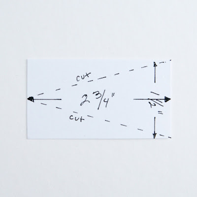
At The Wild Hare Kits, we have a sketch challenge every month, and different design team members have been volunteering to make the sketches. No one had done one for December and since I had a sketch post due right at the beginning of the month, I thought I might as well give it a try. That way I could tailor it to what I actually wanted to do with my kit! ;)

The hardest part was coming up with the concept. I wanted to do a circular layout, but didn't want to use circles or wreaths. I had a vague memory of a layout I'd seen some years ago with triangles pointed inward forming a circle that I'd always wanted to try. And I have a quilt pattern that's similar that I also have been wanting to try. So I started with that.
Once I did a rough sketch on 12 x 12 graph paper, I measured out the triangles and figured out that if I cut a rectangle at 1 1/2" x 2 3/4", marked off the midpoint of one of the short sides, and then cut from the corners to the midpoint, I would have triangles that fit the layout. I used the shape tool to approximate that, and then had the tedious job of replicating it 16 times and coloring them four separate shades of grey. After that, the rest was easy peasy. I LOVE the result!

I have a hard time doing things half measure, so I even designed myself a little signature logo. :) I'll be sharing my resulting layout soon!
Get It Scrapped: Contrast in Title - Style
Hello Scrappy Peeps! I am so unbelievably excited to see one of my layouts on the GIS blog!
DREAM. COME. TRUE.
Here is the link to see my writeup there (different info than here), and the other fabulous layouts showing four ways to add contrast in your titles: https://debbiehodge.com/2017/11/scrapbook-page-titles-with-contrast/
It all started out with the assignment to make a contrasting title and with some REALLY OLD KandCompany gaming dimensional stickers.


I picked the background paper because the circles reminded me of the way the interface of one of the games they all played together, Civilization, is laid out, showing the different territories. Technically they were laid out in hexagons, but I'm claiming artistic license on this one. LOL

So anyway, the circles seemed like a good place to house some clusters of embellishments, and then I got the idea to make little pie charts within some of the circles. They are symbolic of dividing up time between the different activities and games.
I wanted to use some of the empty circles to just list in a spiral a bunch of the different games they've played over the years, but that much black writing would have distracted too much from the title. So I stuck to one semicircle of journaling.

This layout was pure fun to make! I love the primary colors, the kid-like font and gamer font, the little bit of stitching to add texture, and all the cute embellishments.
DREAM. COME. TRUE.
Here is the link to see my writeup there (different info than here), and the other fabulous layouts showing four ways to add contrast in your titles: https://debbiehodge.com/2017/11/scrapbook-page-titles-with-contrast/
 |
| Daddy’s Little Gamer Buddies by Iris Fox | Supplies: Papers: Cocoa Vanilla Studio, Crate Paper, Lawn Fawn, DCWV, Paper Pizazz; Embellishments: Cocoa Vanilla Studio, Crate Paper, KandCompany; Fonts: Game Over Shaded, Orange Juice |

Needing to come up with a high contrasting title, I perused my fonts and settled upon the Game Over font. It's very pixelated, bulky, and shaded, and I knew it could contrast with just about anything. So I pulled out the old gaming stickers, found some photos of my husband playing (many, many hours) with the girls.

I picked the background paper because the circles reminded me of the way the interface of one of the games they all played together, Civilization, is laid out, showing the different territories. Technically they were laid out in hexagons, but I'm claiming artistic license on this one. LOL

So anyway, the circles seemed like a good place to house some clusters of embellishments, and then I got the idea to make little pie charts within some of the circles. They are symbolic of dividing up time between the different activities and games.
I wanted to use some of the empty circles to just list in a spiral a bunch of the different games they've played over the years, but that much black writing would have distracted too much from the title. So I stuck to one semicircle of journaling.

This layout was pure fun to make! I love the primary colors, the kid-like font and gamer font, the little bit of stitching to add texture, and all the cute embellishments.
AN AMAZING ANNOUNCEMENT
I haven't had a chance the past couple months to give this blog any attention. There's a whole long story about home repairs, selling not one but TWO houses, and finding my dream house. I've shared bits and pieces on my Instagram and FB, though most days I'm just too exhausted and don't want to rehash all the nasty surprises, insane amount of work and repairs, and the drudgery of paperwork. All boring stuff, and we're finally getting our keys tomorrow for dream home, and we currently are in escrow for the old home, so we are in the home stretch...
But today I had to come share this news that I've been dying to share. I was asked to join the Get It Scrapped Creative Team for the upcoming year - #squeeeeeeeeeeeee - and the official announcement was today!

But today I had to come share this news that I've been dying to share. I was asked to join the Get It Scrapped Creative Team for the upcoming year - #squeeeeeeeeeeeee - and the official announcement was today!

I'm still not exactly sure how this happened. I mean look at all those AMAZING creatives that have years and years of experience designing and teaching, and I'm a total newb. I am beyond honored to be joining this inspirational team and look forward to a year of creative growth and play, and of sharing and connecting.
Get to know all these lovely ladies in this post.
I'm seriously going to need to get this blog updated! LOL It's in the plans, honest. Just have to get settled into the new house, which should be happening at the end of this month.
xxx whimsy
August Roundup
Here are the projects that I've made for The Wild Hare Kit Club in August! Click on the link under each one to go to the corresponding process video, which also includes closeups. :)
 |
| https://youtu.be/HrZngvMKHPY |


Subscribe to:
Posts (Atom)
-
Hello friends & Hello 2019! I've got a couple special videos up on my YT channel. The first one is a quick chat letting you know ...
-
 I'm over the moon to announce that I've got a new adventure ahead for 2019 joining the Color Cast Designs Creative Team!!! So be on ...


